Traditional SWOT presentations are:
- Not just effective.
- Not just impactful.
- Not just memorable.
- But predictable.
Why?
Because they usually go like this:
- An opening slide with the word SWOT.
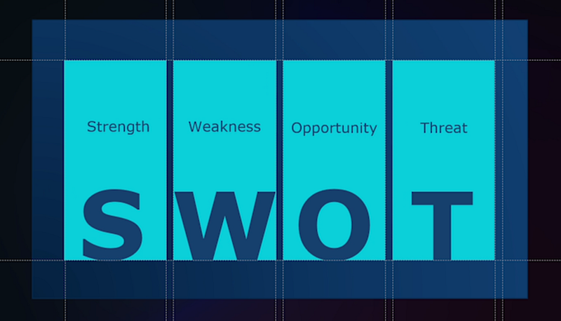
2. Four additional slides or sections, each representing one of the letters, with a list of items under each part.
This has been the standard way to create a SWOT presentation. But what if you could make your SWOT analysis not only look different but also strong and compelling?
Here’s how.
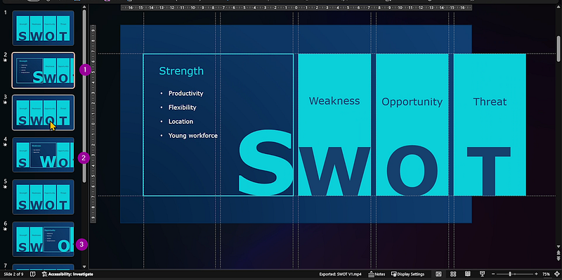
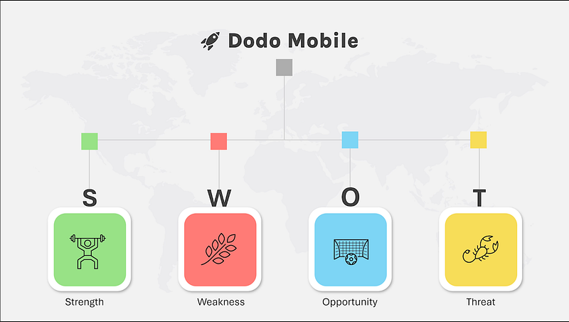
Step 1: Strengths
This is the opening slide of the SWOT analysis for an imaginary company I created for this post.
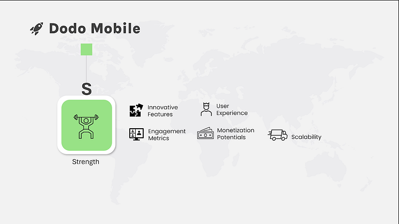
On the next slide, we have the first letter, S for Strength, along with five key points.
Add Depth with a Matrix Diagram:
In addition to these five points, we can demonstrate how the company’s strengths stack up against its competitors using a matrix diagram, ranging from “Innovative Features” to “Monetization Potential.”
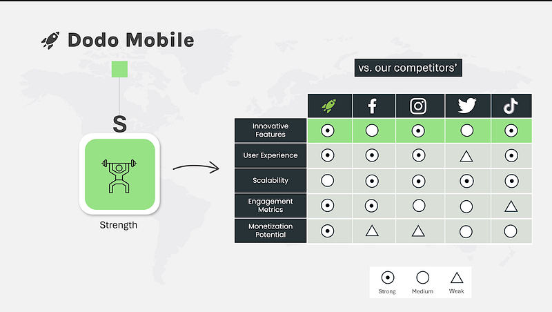
Transferring this information to a chart makes it more impactful than a plain list of key points.
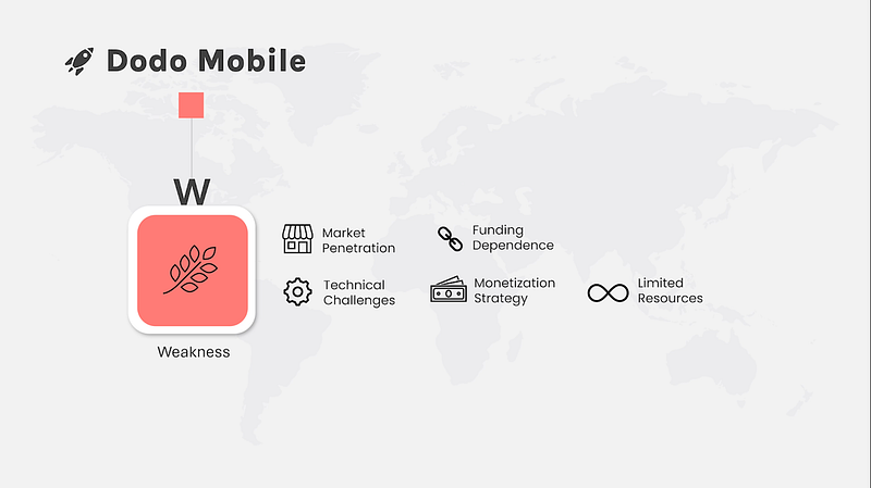
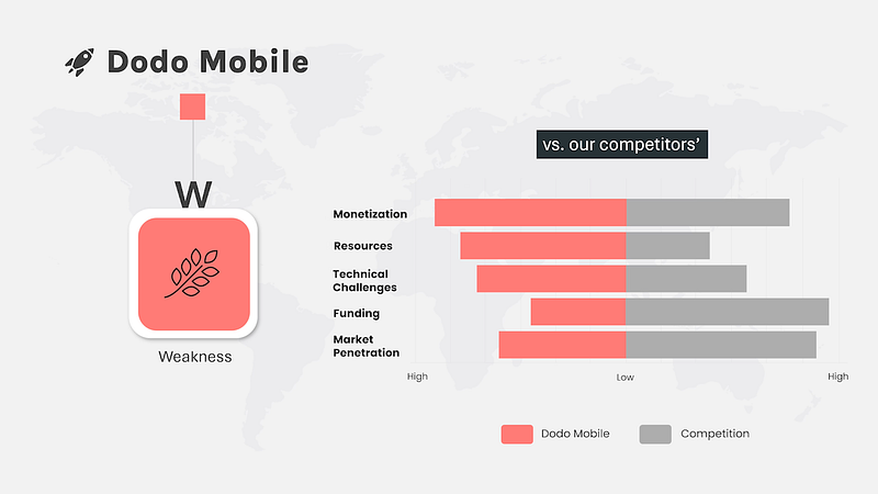
Step 2: Weaknesses
Apply the same approach here: five key points.
But when you transfer that information to a chart, it makes way more sense than a plain list of key points.
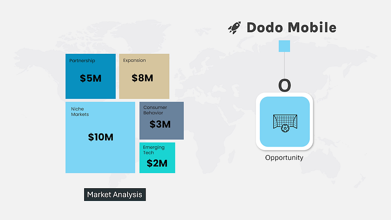
Step 3: Opportunities
When it comes to Opportunities, show numbers and figures associated with each key point. Presenting Opportunity as the final part of your SWOT analysis can be powerful.
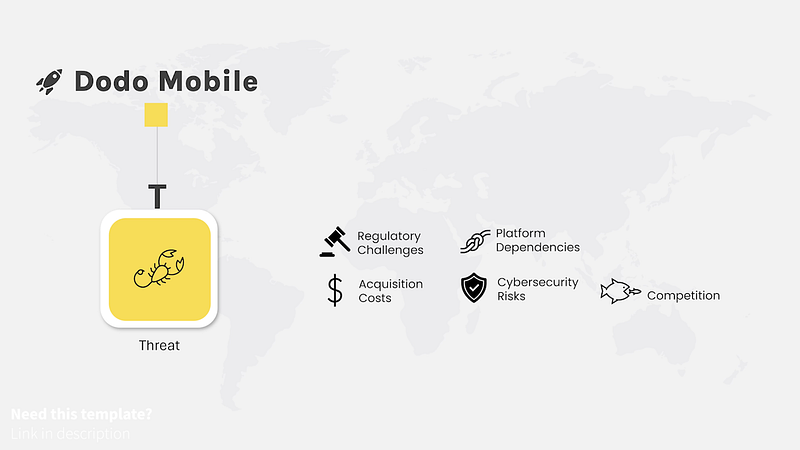
Step 4: Threats
And then there’s Threats. Again, there are five key points.
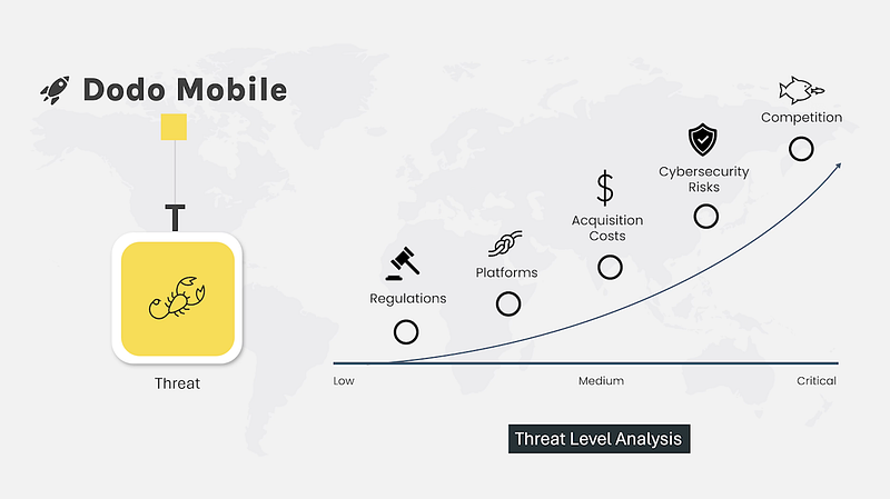
But align them in terms of risk level. Measuring threats becomes much clearer when you can identify which threat is low risk, medium, or critical.
The traditional method of creating SWOT presentations is fine. But isn’t this an improvement?
Download this SWOT presentation here.