Quick. Professional. Effective.
- Charts are an excellent way to show a trend.
- Explain situations.
- And support your message better than any table or bullet point can.
But creating a decent chart in PowerPoint? Time-consuming.
Formatting it? Even more so.
The result? Often, poorly designed charts or dumping data into a table.
So, how can you create good-looking charts with minimal effort in the shortest amount of time?
Tip 1: Save Time with Chart Templates
Here is a beautiful column chart showing sales for three items.
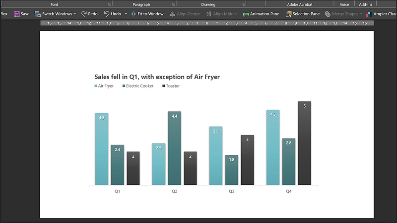
At first, it looked like this.

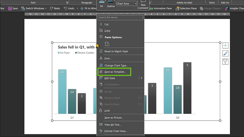
If you know you will need this type of chart in the near future, instead of re-creating it all over again and taking more time to format it (like I did for this one), here’s a time-saving tip:
- Right-click on the chart.
- Save it as a template.
Next time, if you need the same type of chart:
- Go to Insert, Chart.
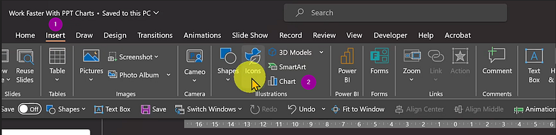
2. Click on Templates, select the template, and hit OK.
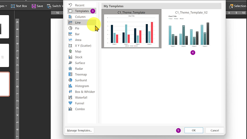
You’ll get the exact same chart.
Just edit the series and categories.
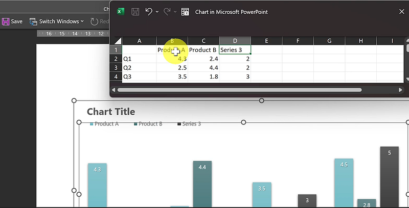
Done.
Save time. Maintain consistency.
Tip 2: Use Animations to Control Chart Sequence
Avoid displaying the entirety of your chart, which can be overwhelming. Break it down with animations.
Start with:
- Categories.
- Vertical and horizontal axes.
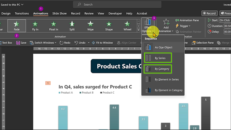
Then, reveal data points one by one with animation clicks, either by categories or groups.
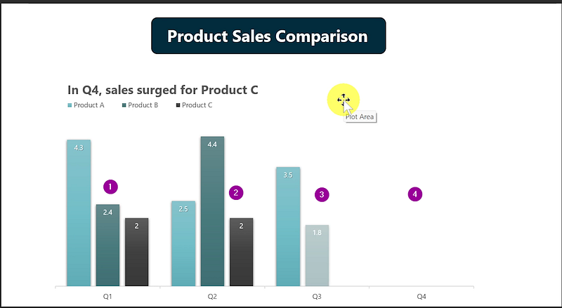
Simplify your message. Keep your audience engaged.
Tip 3: Leverage Add-ins for Impressive Charts
Busy but want amazing charts?
Try add-ins.
This one offers a variety of charts and graphs.
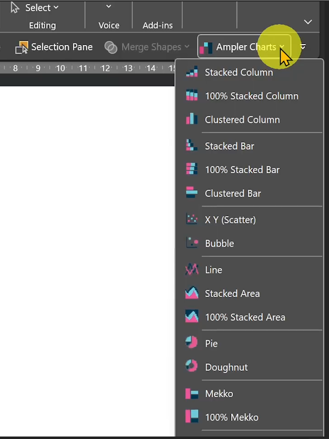
For example:
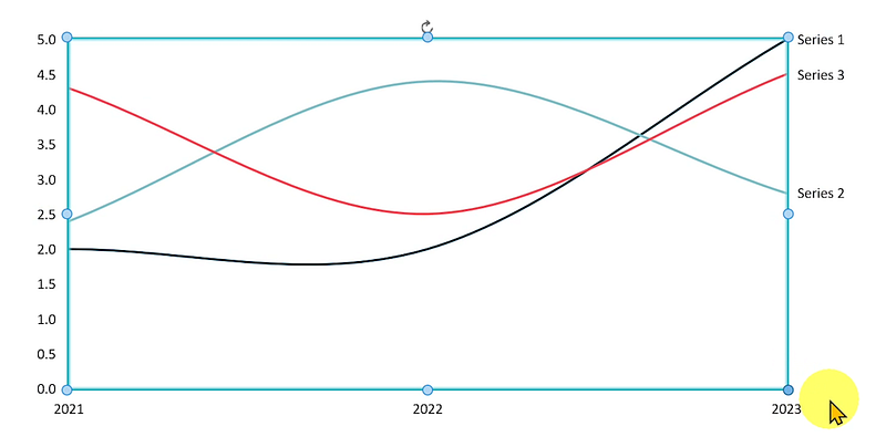
- Click and drag for a Line Chart.
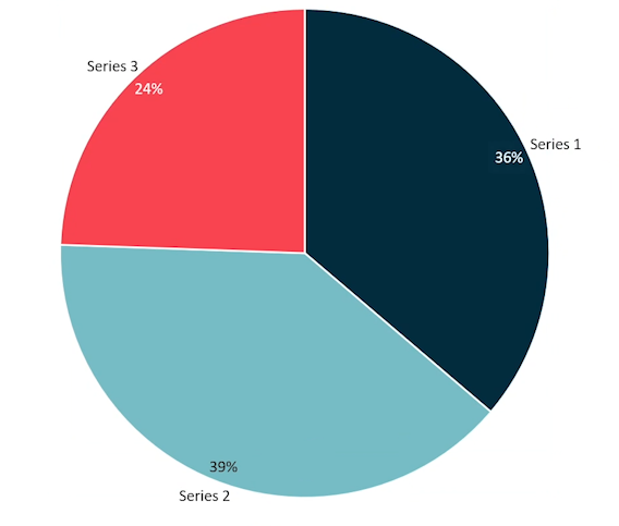
- Want a pie chart? Easy.
The add-in isn’t free, but it offers a 30-day trial.
No sponsorship — just a great tool.
Quick. Professional. Effective.
I hope this information was useful and valuable.
Follow me for more time-saving tips on PowerPoint productivity.